GameOn!
Missing the Big Game?
One of the worst moments of being a sports fan is wanting to watch a game and not knowing when and where to watch. This issue was my inspiration for designing GameOn!
In the world of live sports, you can miss a major event in a moment so creating an app that was well structured and easy to navigate quickly was key. Users' ability to navigate from home screen to view the information in 25-30 seconds was a major goal I established for this project.
What makes a good Sports App?
I interviewed a pool of 12 participants that I'd screened to match the following criteria:
Ages 18-38
Sports fan
Has at least one sports companion app
The interview goals were to determine:
what sports apps they were currently using
what features made them enjoy or continue using the app
pain points with these apps they'd like to see corrected.
User Goals
To find score information
Keep tabs on game times and events
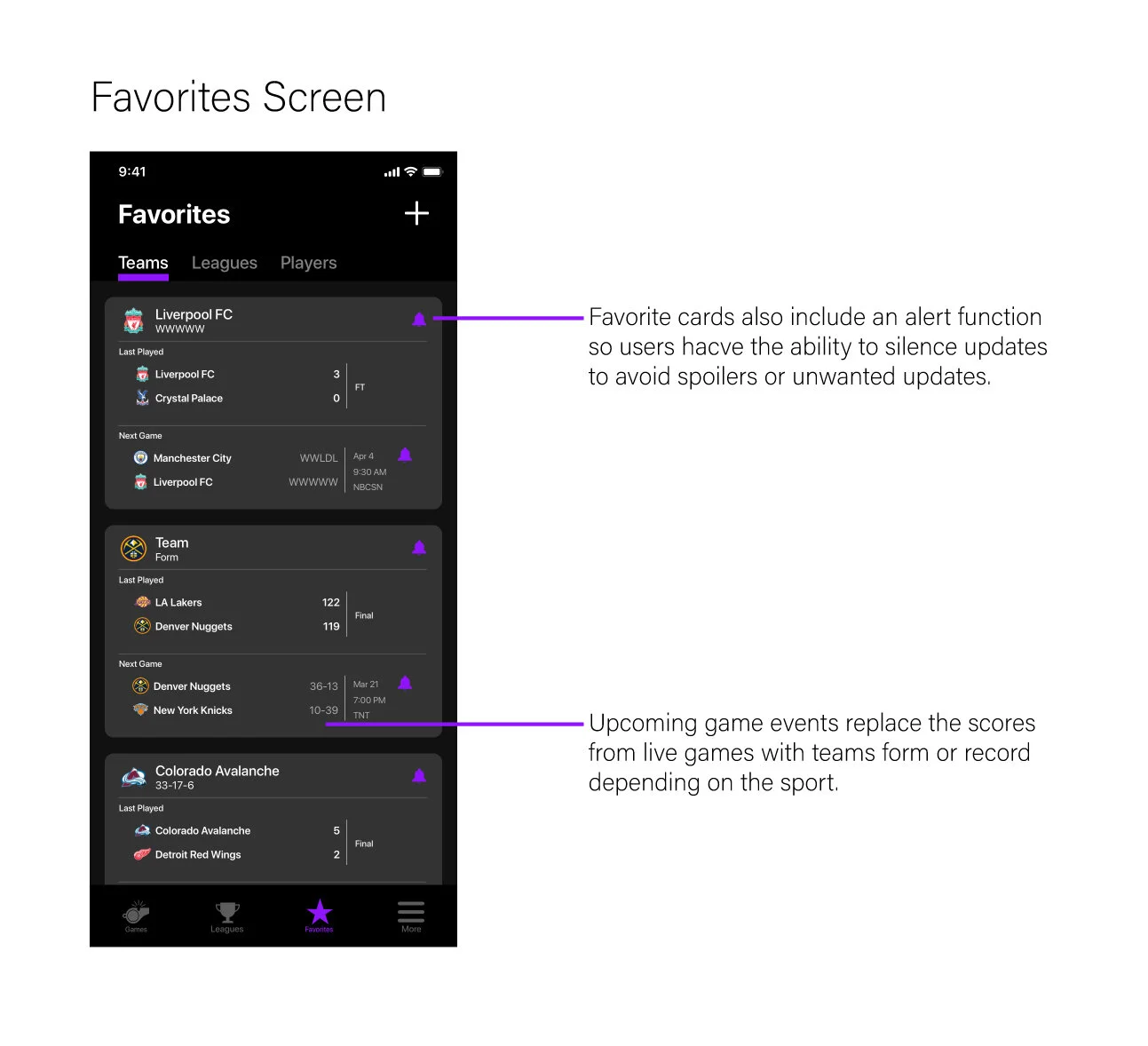
Quick Access to favorite teams information and schedule
Pain Points
Lack of access to channel information or where to watch the games
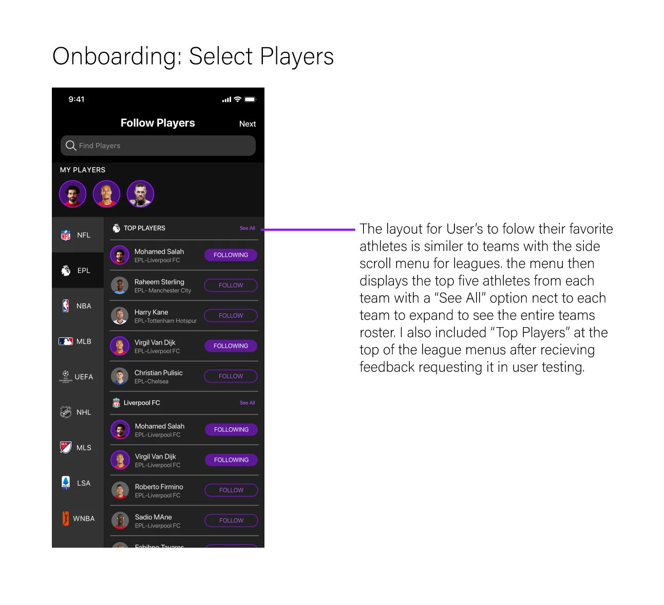
Several apps users expressed confusing onboarding process for selecting favorite teams
Satisfactory Features
Team selection in the onboarding process
Game viewing information
One-touch notification silence on specific games
Learn from the Competition.
I conducted a holistic competitive analysis, looking at top apps in the market and at the apps mentioned by user research participants. The criteria I used to determine these competitors were as follows:
Market:
App Store Ranking
Star Rating
Users I Interviewed:
Frequency of use
Satisfaction / Sentiment
Building the best team of features
I created an impact/effort matrix to help visualize my development priorities based on user feedback. Therefore things that would be expected from a user like Score Updates and Following your Favorite teams would register high on the impact axis.
Once I felt confident in every feature being placed accurately I determined what features were critical to the application's design
I included an onboarding process that allows fans to select their favorite leagues and sports, ongoing and upcoming events sections, as well as game-specific informational screens, which would consist of viewing info and notification options.
Drawing up a design plan
I had previous experience designing for iOS guidelines, so my strategy for sketching and wireframing was to draw an iPhone screen and then translate that design to an Android-style device.
I took care early on to make sure I kept UI patterns consistent with their standard guidelines, like swapping the iOS drop-down menu arrows for the kebab menu icons more common to Material.
Iterate Iterate Iterate. Make the best product for every device.
I added a favorite tracker at the top of the onboarding screens that allowed users too easily keep track of their selections. The horizontal scroll interaction was important to help save vertical real estate while allowing users to easily interact with prior selected teams/leagues/players.
I chose a date tab/scroll bar for the iOS design. After putting something similar in the Android wireframes, it made the top navigation appear too busy, so I stuck with the original plan of making the date picker a floating calendar button and limiting dates to a week prior and a week after.
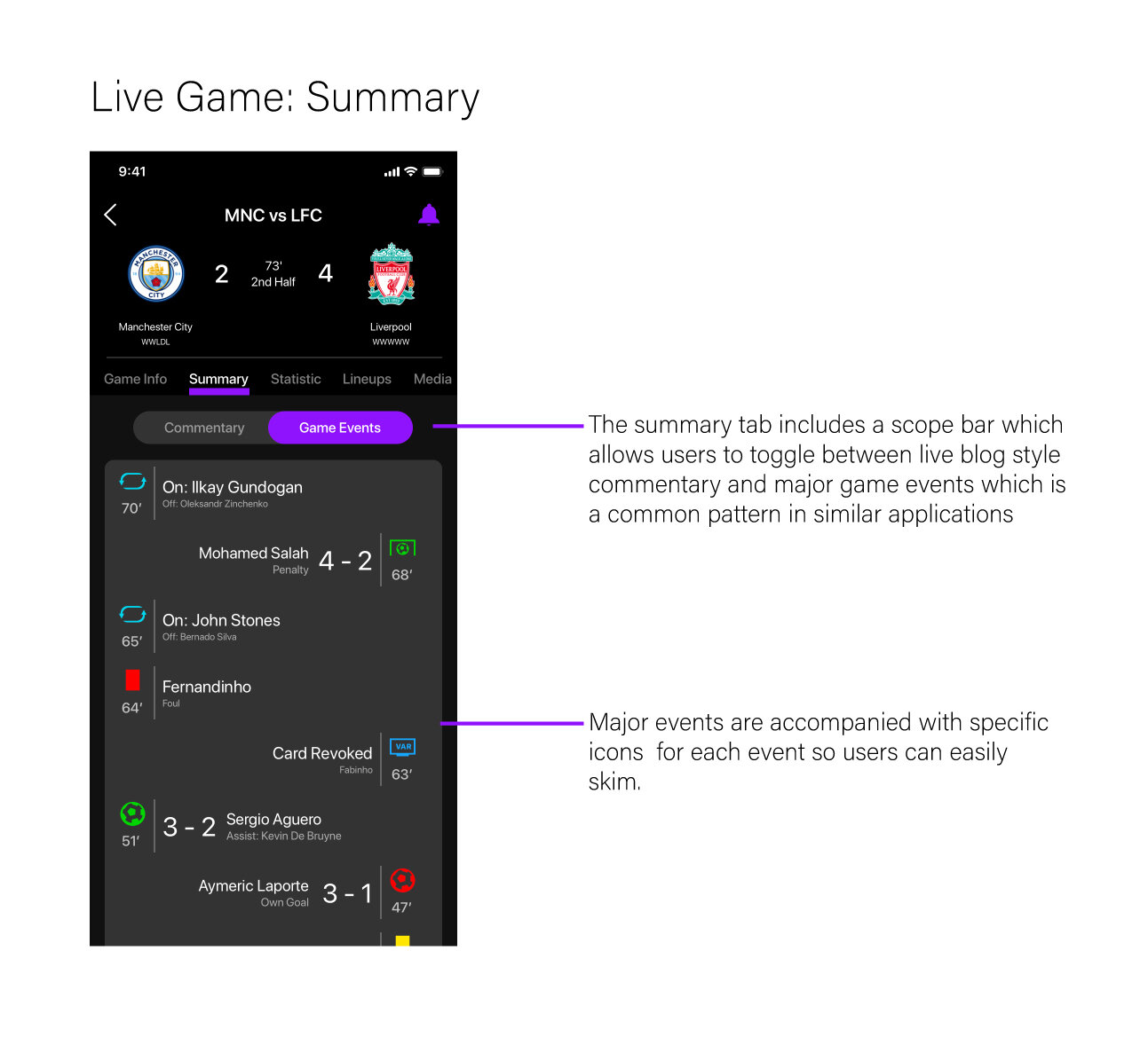
The critical piece of the design was efficient navigation that allows the user to find viewing information, as well as in-game events, quickly. After a user selects a game they will see this screen, which employs a scope bar, allowing the user to switch between viewing information and game events.
Usability Testing
Users task was to navigate through the onboarding process and then find the viewing info for one of their favorite teams live game. All users were able to complete the task in under a minute, which was reliable results for me to take forward into my high fidelity designs. After each user completed the prototype test I asked their opinion of the app's current layout for both iOS and Material - basically if it was useful and usable.
4/5 users had difficulty tapping to navigate and struggled to read certain texts. I addressed these issues by increasing icon size and the spacing between elements. This successfully informed the development of my high-fidelity iterations.
Final Designs
Results
After eight weeks of research and design, I felt happy with the product I had created. I set out to create a sports companion app with easy navigation and viewing info for all live sports and believe I built the best possible product on the timeline I had.
After testing the high-fidelity designs with a larger pool of 15 users, I found that everyone was able to complete the same task in under 55 seconds. In turn, all the users had positive reviews about the usefulness, usability, and value of the product. The most satisfying part was after the last round of Usability Tests where 90% of users stated they would replace their current Sports companion app with GameOn!
Conclusion
If I had two more weeks to work on this project, I would have worked on other features from my original features list. Specifically adding more team information and statistics to the team info screen as well as adding a similar informational screen specific to leagues; showing team standings, top scorers and similar statistics.
If I had to pass along any information I learned from this process is that testing early and often really is invaluable. Starting my testing at the mid-fidelity levels rather than later on in the journey saved me massive amounts of time, so I was going back and tweaking a more sophisticated level product. I think the final product I came up with was a slam dunk!


