Coin
Learning to save can be hard
Reaching a savings goal and learning good financial habits is difficult; that's where Coin is here to help.
Coin was the final project of my UI Design course CareerFoundry; the task was to create a set of deliverables for a client based on a supplied design brief and UX research. I had to develop brand guidelines for the app and the following deliverables: a user flow, wireframes, user testing notes, and a final user interface design.
People agree, tracking finances can be a real chore
The objective of the app was to help people save money quickly in preparation for a big purchase or expenditure. The tool was for people who want to save money, immediately, for a particular reason.
It should display data on the user's finances (how much money they spend and on what), and tells them what they can do to cut costs and save money in a certain amount of time. Users will utilize the tool in the period before a planned expense.
Saving money can be hard, especially when you don't have a long time to do so. By providing personalized information on how a user can save based on their actual finances, the tool itself can give financial advice during these finite periods of saving.
How do we make finances and savings easier?
With this information in mind, I compiled a list of features to include in the app based on input from user stories supplied in the brief. Users should be able to:
Create a profile
Receive financial advice personalized to them, their spending habits, and tailored to their goals
Input information on the money they are receiving and spending (and on what)
Be notified and rewarded when they have reached certain milestones throughout the saving period so that they know whether they're on track to reach their goal.
I started with the ability to create an account and add their financial information. I placed this to be part of the onboarding process so users could immediately get started.
After that, users have the opportunity to set up any immediate savings goals they have. Since the main focus of the app was saving for an immediate purpose I put this "Create Savings Goal" feature at the end of the onboarding with ability to add more/newer savings goals later .
The home page would then allow users to access to the other key features: financial status, Savings Tracker, and finance input for income and spending.
Designing for easy input and understanding
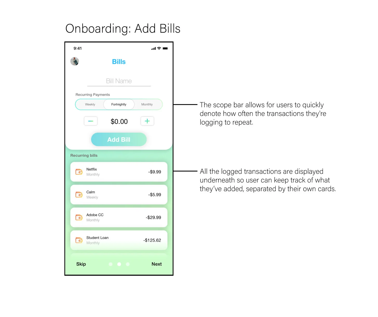
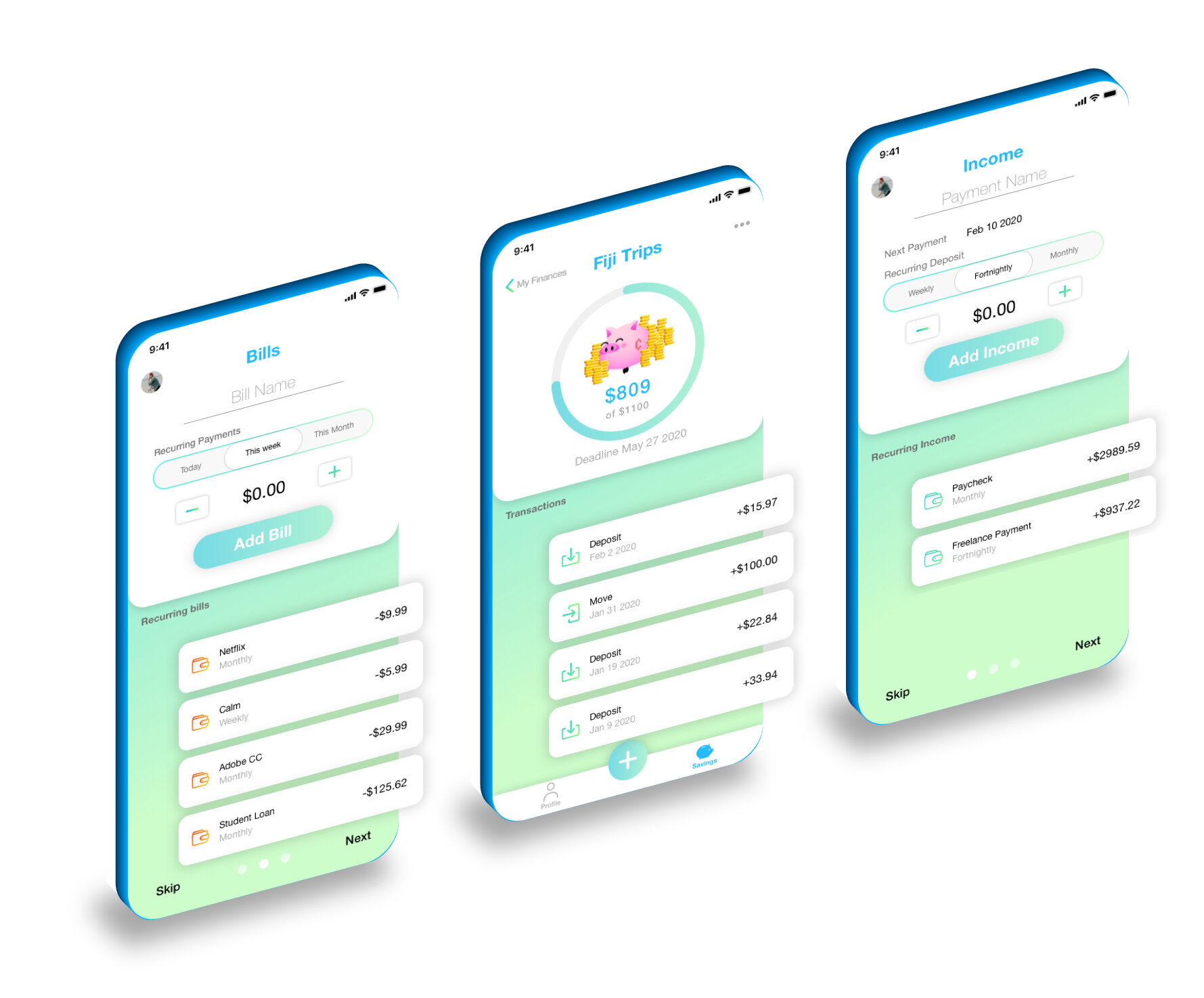
Inputting Finance info needs to be easy and quick. When users start onboarding they can add recurring income or bills. Every recurring piece of a users finance is added and tracked with this screen style allowing them to add recurring time, payment name, and amount.
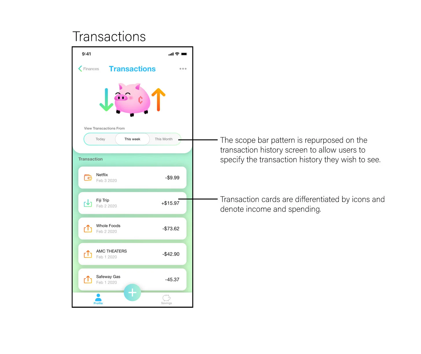
Users will often be new to savings and making it easy to visualize progress is key to keeping them using the app and building good savings habits. A progress bar with a general overview of the savings goal gives users an immediate insight into progress. A list of previous transactions made into the savings goal account gives users a more detailed overview of how their habits are helping them achieve their goal.
I included a second savings option called “The Rainy Day Fund” where users could opt into the app creating a fund that was not set aside for a significant expenditure but instead saved between 5-10% of recurring income. The rainy day fund would help teach users the importance of setting funds aside not only for big buys but also emergencies. I felt this small add on feature was a great way of instructing users on healthy financial habits.
Usability Testing
I began remote usability tests with eleven users and had them record their screens for me to analyze for pain points. I also conducted a brief interview afterward to get their opinions and have a better knowledge of where their struggle may have arisen. My goal was to answer three questions:
Is it intuitive? Is the design easy to navigate?
is it informative? Does it display all the information you wish to see? Informative
Is it impactful? Do you feel like the experience makes savings and finance tracking less of a chore?
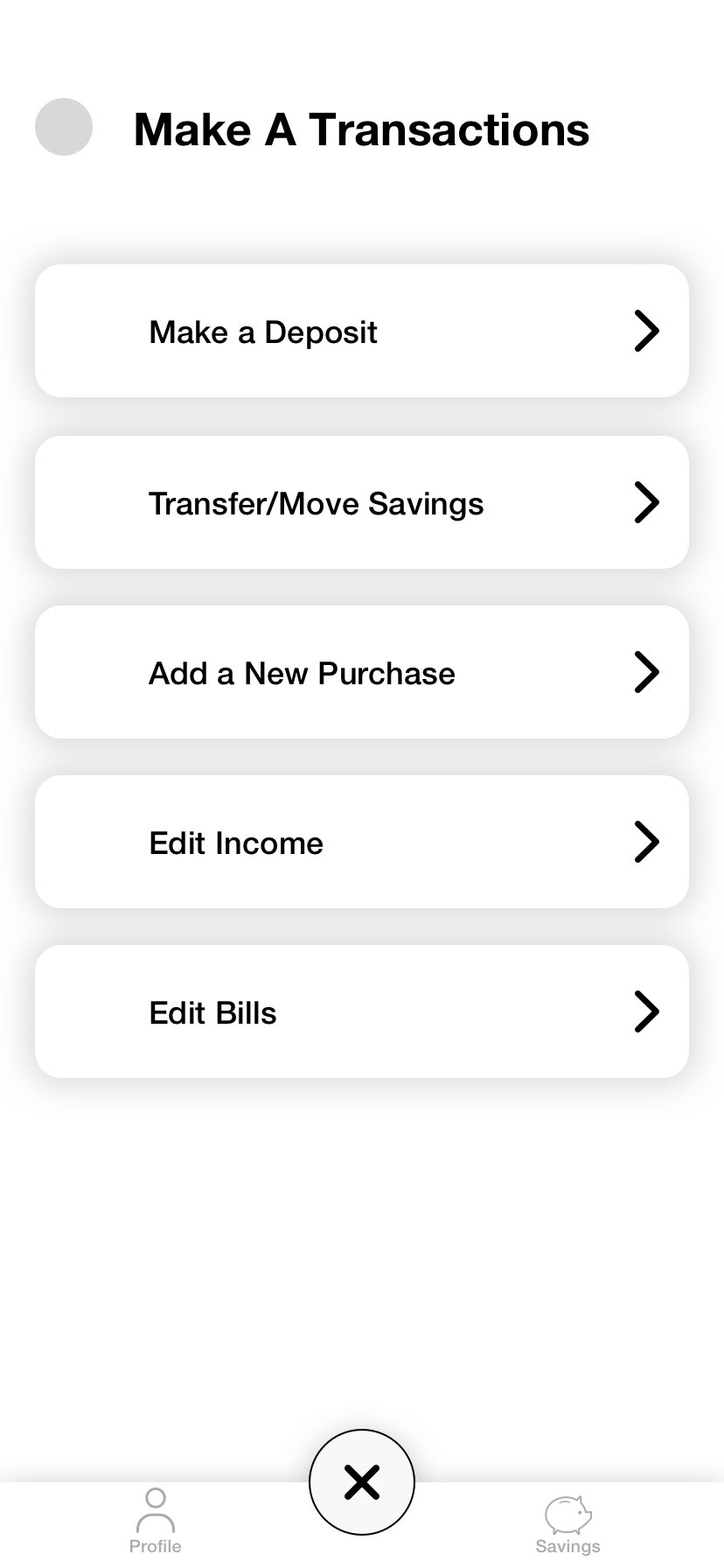
I found that each user wasn't sure of the center button’s, designed to be the coin logo, function and wound up trying to locate where they were supposed to log the purchase after they completed the onboarding. Still, after clicking the Coin button, they were able to register their transaction smoothly. Users all stated they felt that the expanded menu would make adjusting their finances easy, but they had no idea what the Coin button did until they interacted with it.
I decide to do a large overhaul based on user feedback and scrap the original design for users to input transactions and lose the implementation of the Coin icon. I also received feedback about wanting to see more information on the savings screen so users could easily thumb through open and previous savings.
Final Designs
Results
I think the most challenging part of this project was my lack of knowledge concerning financial habits and savings. However, I was able to address this issue by reading articles on the subject. I was unable to conduct industry research and interviews due to time constraints.
Despite this I was able to get positive feedback for users. Conducting post usability test surveys I received positive reviews for the apps ability to entice a user into returning to save. 82% of users stated they were more likely to use this option because of its easy to navigate features and ability to simply convey savings progress.
A key takeaway for me in creating this app is just because I am supplied with UX research doesn't mean I don't have more research to conduct as a UI designer. Utilizing other research along with what I received was vital to the design of a successful app.
Conclusion
If I had two more weeks to work on the project, I would have done some interviews with professionals in the financial industry. I had real user stories but felt more industry research would give me more ideas of what to add to the user finance hub other than cash flow and spending charts. I would have also liked to explore more user journeys like adding an income source with options for remainders to log income for hourly workers or those who make a commission.
I would say I plan to revisit this project in the future as I have a passion and desire to learn more IxD skills and feel as though I have set this project up well for a case study in that field.


